Whether during peak times or throughout the year, brands must communicate effectively to cut through the clutter and grab consumers’ attention and buying intent. Brands aren’t lacking in innovative options to add to their media mix, thanks to emerging digital strategies to target and speak to prospects.
For retailers, who have a number of physical points of sale, drive-to-store is an essential lever to include in their advertising budget. Aimed at generating qualified traffic in stores, effective drive to store campaigns require well-thought-out creative variants to increase user engagement and interactions with the ads.
Here are five tips for engaging ad creatives, with examples of original visuals developed by Near’s creative studio, to inspire your next drive-to-store campaign:
Use Staging to Show Off the Products:
Ideal for brands in the furniture, decoration or DIY sector, staging allows you to highlight your offers in an original and immersive way.
By showing products as part of a harmonious decor, the user can better project the products in their home and compel them to learn more. The creative should also be geo-contextualized to promote the offers available in the store closest to the user. And depending on the products available in the points of sale, the visuals may vary to offer different scenarios.
Here is an example of an ad for the furniture sector during a sale. The format can also be used for the end of year celebrations, Halloween, and more with decorations matching the theme.
Integrate Your Digital Catalogs into Ads:
As retailers look to move away from unsolicited paper flyers and catalogs, digital catalogs promise to be both an alternative and complementary solution.
By retaining the opportunity for the advertiser to promote a wide selection of products, the digital catalog can take different formats in order to effectively promote the array of products brands have communicated using traditional paper formats.
By placing each point of sale at the heart of the creative, the digital catalog is a response to the challenges raised by a multi-local marketing strategy. In addition, integrating CTAs (Call To Action) on the visuals makes it possible to direct the user to the nearest point of sale.
Here are examples of the “Mosaic” and “Slider” ad creatives, developed by the Near team to show how you can highlight products for a specific season, like back-to-school, for the retail sector.
Add a Countdown Leading Up to an Event
Countdowns in ad creatives can be an interesting visual to mark the beginning of a sales event, store opening or product launch. The countdown gives a higher degree of importance and urgency to an upcoming event, which remains in the minds of the people exposed.
The time-out concept develops a sense of urgency in the user to generate more engagement. An innovative DCO (Dynamic Creative Optimization) can then redirect the consumer to a nearby point of sale if they wish.
Here is an example of how fashion brand could use a “countdown” in their ad creatives leading up to their Black Friday sale:
Integrate Google Reviews
Because drive to store ads aim to generate qualified traffic in points of sale, it’s important to pick the right information to highlight. And what better way to attract consumers than to show them reviews from happy customers?
By integrating the point of sale at the center of the solution, the ad creatives can be personalized with a lot of information specific to the store. As users regularly consult Google reviews, you can proactively highlight them in ad creatives for each store.
Adding a “Scratch & Win” Component
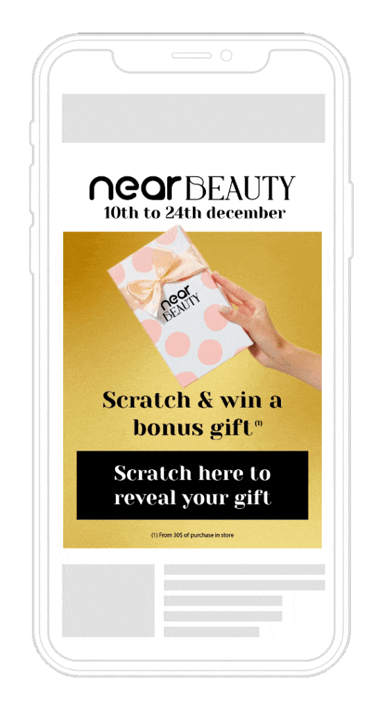
Do you want to highlight a promotion, a new product or simply encourage interaction? The scratch & win visual aims to engage the user and increase their purchase intent once they discover what they’ve “won.”
This concept generates curiosity, and therefore a more specific interest in the offer put forward. The visual thus presents a logical sequence inviting the user to scratch their screen, then click on the CTA which will redirect them to the store to redeem their prize.
Here’s an example of a scratch & win ad for a fictitious cosmetics brand:


